Pilot Flying J
CATEGORIES | CAMPAIGN, BRANDING, PRINT, DIGITAL
AGENCY | DELOITTE DIGITAL
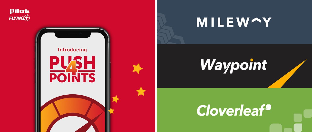
We worked on two projects for Pilot Flying J. They wanted to promote a new perk on their phone app and also develop a loyalty program for their customers. I helped create the graphics package for the ‘Push 4 Points’ promotion and also came up with some visual directions for their loyalty program.
Push 4 Points Promo
‘Push 4 Points’ is a program that Pilot offers to their customers in which upon activating, drivers can gain points for the gallons of fuel they use and redeem those points for in-store savings on essential services, food, and merchandise. I made the printed and digital assets to promote this new program that were used in their app, emails and social media, and printed signage across all Pilot locations.

Type Lockups
Print Ad Thumbnails
I first designed several thumbnail sketches to explore different layouts and styles.
Mockups

Pilot Loyalty Program
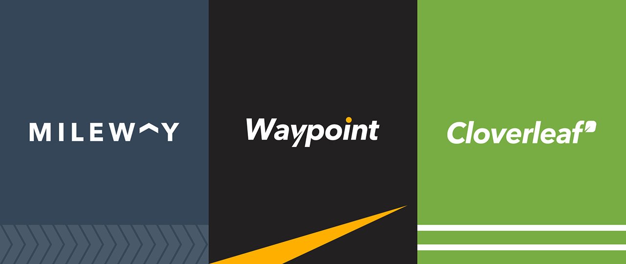
The loyalty program was envisioned to give participating drivers a VIP experience. Because of that, we wanted to come up with a unique look and feel to match the exclusivity of the program and make it distinct from the Pilot brand. I came up with three different visual directions.
Design Thumbnails
I first designed several thumbnail sketches to explore different layouts and styles.
Defining the Territories
Then, the team bucketed the different styles and logo explorations under each direction.

Direction A
This direction simplifies tire marks as a graphical pattern and uses arrows to direct and point to the subject matter. The arrow is also utilized in the logo lockup, replacing the letter ‘A’ and pointing upwards to symbolize moving forward and progressing. Colors are inspired by elements of the outdoors and roads.
Direction B
This direction has pointed triangles to depict roads and navigation and uses subtle grungey textures as a way to symbolize the dirt particles trucks collect when driving long distances. The textures are juxtaposed with simple shapes, de-saturated photography, and large white backgrounds. The color palette is minimal, using a bright yellow and blue to highlight parts of the design.
Direction C
This direction takes visual cues from cloverleaf interchanges and uses solid lines to illustrate and outline the shapes of different roads, tunnels, and bridges. The shapes that make up the clover can be separated to create a unique pattern or used in the logo lockup. Colors are simple and optimistic and inspired from nature.