
Grainger Data Narratives
CATEGORIES | UI DESIGN, ICONOGRAPHY, VISUAL DESIGN
Grainger is dedicated to giving helpful tools and information to its customers. The goal was to provide a collection of interactive infographics to educate and inform. The tool would explore hidden metrics and stories often only uncovered through well thought-out charts and graphs. I designed the UI for the data based off of the OHSA Top 10 and came up with several explorations. We wanted to elevate the graphics by using a clean style in order to communicate information simply but effectively.

Style Explorations
The first steps of the design process was exploring the style of the data narratives. These designs were preliminary and meant to start a conversation about the look and feel. Thin or bold and minimal or complex- were attributes we focused on.
Posters
(Click to enlarge)


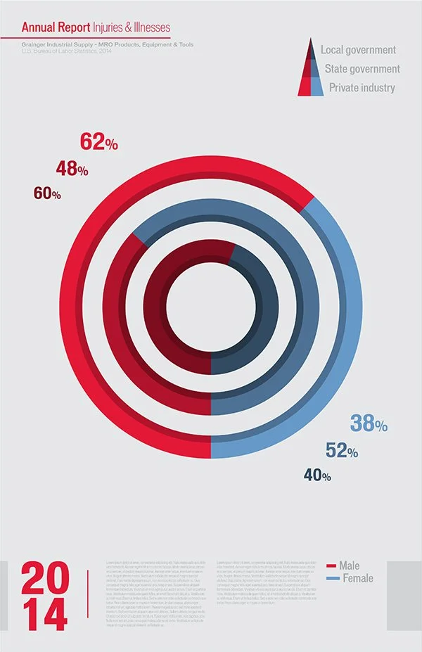


Donut Charts

Iconography
Icons were used to represent the different types of data.
Infographics
During this process, we tried different color combinations and layouts of the UI.
Illness and Injury by Part of Body

Illness and Injury by Source


Days Away from Work by Source


Top 10 Citations Over Time

Incidence Rate by Business Size


Falls by Source


Workplace Safety Overview

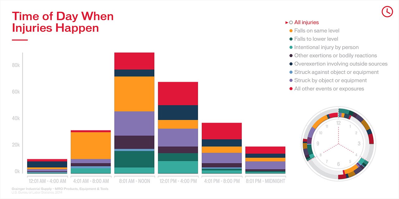
Time of Day When Injuries Happen

Map of Top Fine Per State


